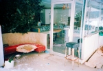
I’ve just started a film test in preparation for my trip to Italy next month– the two films in consideration are Kodak Ektar 100 and Agfa Precia CT cross processed. Thus far, most of the artworks from my current series A New Eden are either XPRO (cross processed- E6 film in C41 chem) or expired film. However- after much testing here on FR I have recently fallen in love with the new Kodak Ektar …SO I decided to do a quick comparison test and find out: does the XPRO effect really have to be actual cross-processed film?
So what do YOU think? Look at the snapshots below and see if you can pick out the one that is the Agfa Precia CT XPRO…only one is true XPRO…the others are all Kodak Ektar in Photoshop using Alien Skin Exposure 2!
Think you have the right answer? Then give a listen to the Audio portion of this post for additional thoughts on cross processing / Xpro… as well as the answer!
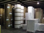
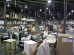
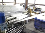
This audioblog is a quick list of observations I made on my recent visit to Canson Distribution Facilities here in the US. In the coming weeks I will be reviewing their new offerings, 17 papers and canvases in all! Give a listen and stay tuned!
Below find a sample of images I made at their US facility…its over 140,000 square feet!!
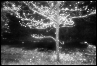
I was lucky enough to get a brick plus (35mm) of the new Kodak Ektar film at Photo Expo Plus in NYC… so when I returned to my studio in Vermont I quickly loaded my Leica M7 with a roll and decided to make a few “test” shots around my yard.
Image Results:
The Full Size image is a 20″ x 30″ print- the crop represents a 4″ x 4″ section of the full size.
Testing Specs:
Leica M7 with Leica Summilux 50mm 1.4 Lens
F 5.6 at 1/125, Hand-held
Film was rated at Box Speed (more on this later…)
Scan was done on an Imacon with NO sharpening applied, scanned at 6300 dpi.
Photoshop work was limited to white point and black point, no color correction, no noise reduction, no sharpening, no curves…
Image Size/ File Size Info:
309 MB file at 300 Optical DPI, 16 Bit
20″ x 30″ Print Size
Initial Thoughts:
This new offering by Kodak has very tight grain (this is 35mm folks!!) with good, bold color but still “neutral/ natural” in feel. My initial feeling is that it is a bit slower than box speed (normal for most negative material). On my next test roll I will rate it around 50-64 which should be perfect (with color negative material its better to be safe than sorry with regards to your exposure!). Box Speed (ASA 100) is usable, but under difficult lighting situations underexposure is just too great a risk. So far… I am very impressed…stay tuned for Part 2 in a few days.
Over the next few months I’ll be writing several articles on the LOMO LCA and LCA+. I’ve decided to use these small and very opinionated cameras for my new artwork series, entitled Vanishing Vermont. Articles will focus on working with these cameras, how to carry them, films to use and why… XPros, where to buy and differences in current and older models.
I know there are a lot of opinions out there (both pro and con) about the LOMO (LOMOGRAPHY) and I look forward to an open discussion, so first lets agree on two things: 1. Its the print that counts! 2. See number 1.
Here are a few helpful links to get things started…check them out and stay tuned!
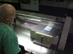
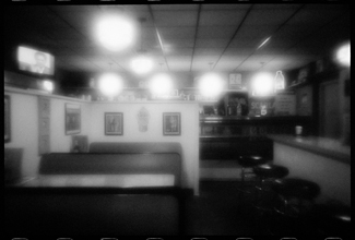
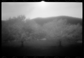
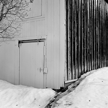
Some years ago I did extensive work with pinholes, Zone plates and Holga camera systems, specifically for my Through A Glass Darkly artworks and book. Recently I decided to give a Zone Plate a try on my Leica M7 (it is a 28mm f/32 Zone Plate I purchased from Pinhole Resources) and TX processed as I have already outlined here on the Figital Revolution using Diafine Developer. It seems to me that this combo of TX/ Diafine/ Zone Plate and Leica M are a perfect combo. The TX and Diafine Developer really help control the Zone Plate with regards to contrast and it also gives me a high enough EI to make hand held shots very possible (my usable range for TX in Diafine is 400-1600). The M7, or really any rangefinder camera system is nice as the image view is not reduced (illumination) by looking through the Zone Plate as would be the case with an SLR (of course this means that you will have to visualize your final image as none of the Zone Plate qualities will be visible until you process your film assuming you’re using a film rangefinder). Of course digital capture would give you instant feed back (did this a few years ago in the American Southwest) but I just love the look of this combo. Scans were done in house at Indian Hill Imageworks on our Imacon Scanner, wet mount at 3200 optical dpi- a few resulting images are below from my first roll…
For more information on using a Zone Plate or for that matter what is a Zone Plate check out the links below.
I find this post very disturbing to write and a sad reflection on our current economic situation here in the US, as well as an unfortunate look at the trend in book publishing to find the cheapest and “good enough” printing press for the production of Fine Art Books. Where are most “fine art” books printed now?…China! That is not to say that good books can not and have not been printed in China, but we all know there is a huge difference between a book printed on a cookie cutter press and one printed at a true fine art printing press.
I personally have been very fortunate in my career thus far, having my first book printed at the Stinehour Press in Lunenburg, Vermont and my second book at the Salto Press in Belgium. Both of these presses represent the pinnacle of printing quality (which translates into options for the artist) yet now it seems that the Stinehour Press will be no more in just a few months.
Founded in 1952 and employing over 21 employees the Stinehour Press had won numerous awards for printing excellence and it’s collection of printed books and materials reads like a list of luminaries in the field of Art with a very large capitol A. Stephen Stinehour, who I consider a personal friend, left the press several years ago to pursue other printing projects, yet I know he finds the closing of the Stinehour Press- which was founded by his father- a sad statement on the currect position of the printing industry in the US.
In our quest to get to get the most for our dollar (or Euro or whatever) many people seem to lose sight that in that process of “how low can you go” a lot is lost… and once it is gone it is gone forever. In the “new” industry of Giclee Fine Art Printing I can remember only a few years back where how cheap and how fast you could print was the driving force for marketing products and services. Fade-out/fade-in 5 years and most of the get-rich-quick printing operations are gone, dying, or consolidated because you can only cut costs so far and most of these technologies at the end of the day are still quite expensive to run and upgrade. It seems correct to me that a great print deserves a fair price/competitive price…but you have to compare apples with apples. Also remember that cuts in cost almost always come at the expense of quality and workers pay or health benefits…you know the complaint and I’m sure you hear it everyday on the news or in your own community. Continue reading “End of an Era…The Stinehour Press is Closing!”→
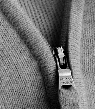
Finally part 2! Here are some sample images made on my M7 Leica and my Rollei 2.8 (F – 1960) using Fuji Acros at an EI of 160.
The two square images of course were shot with the Rollei (120mm) and the hand and zipper image was made with my Leica M7. Full size the Rollei images are 18″ x 18″ (142MB, 16 Bit, Grayscale, 120mm Negative, 3200 dpi scan) and the hand and zipper image is 16″x 24″ (160MB, 16 Bit, Grayscale, 35mm Negative, 6300 dpi scan). The detail crop of the zipper represents approx a 3″x4″ section of the larger 16″x24″ print…amazing!
Here is how I processed it…
Fuji Acros 100…EI 160
Diafine Developer at 68-72 F
Part A 4.5 minutes (two inversions every minute…gentle.)
Part B 4.5 minutes (two inversions every minute…gentle.)
Water Stop 1 minute Fill and Dump (68-72 F)
Fix Kodak Rapid (5 minutes)
Wash 1 minute running water (68-72 F)
Perma Wash 1 minute constant agitation
Wash 5 minutes (65-75 F)
LFN
Dry
For more information on the process and testing conducted please listen to the audioblog link below….
TIP– When your developer starts to get dirty…say after 30 plus rolls just run it through a coffee filter to “clean” it…use a different filter of course for each solution.
This is a test in progress post but I feel really good (and excited) about my results so far and wanted to share…
Here is a difficult test image (huge dynamic range) shot with 35mm Acros 100 (Diafine EI 200) with my Leica M7 and a 50mm F1.4 Sumilux at F8.
The processing is very different than suggested on the box or in previous posts- I will be posting the developing “how to” after this weekend as I want to run just one more test. The full size image which was scanned at Indian Hill Imageworks on our Imacon at 6300 dpi, fluid mount, 16 Bit is 24.5″ x 16.2″ (optical resolution). The crop image is a 2.5″ x 2.5″ section of this larger file…do you see the bent nail?! The large file link at the bottom will download a scaled down version (Approx 10″ x 6″ @ 360, 8 Bit) so say around 8MB uncompressed (best for high speed users only) will give you an idea of what is possible with the incredible combo…the full file (98MB) is amazing.
OK, this is a quickie. I’ve been running some tests here at Indian Hill Imageworks to determine if using contrast filters such as:
Light Yellow 021
Light Red 090
Yellow Green 060
would cause a problem with this awesome film/ developer combo. Answer: NO. I personally like no filter or a ND if I’m shooting in bright light (remember TX in Diafine has an EI of 1250 to 1600 so unless you like F22 at 1/1000th its ND (Neutral Density) or Contrast Filter time!) I love the full gray tones of this film/ developer combo and find the “straight neg” is the easiest to scan and get every bit of tonality.
NOTE: On the Light Red 090 just be very careful with your shadow placement.
NOTE 2: ONLY use good filters…I like B+W and Heliopan…Yes they are expensive but worth it! Here is great resource for an explanation of Filter Flare and other optical stuff!
What, you say?! No sample pictures with this article (horrors)!!???…Go make them yourself you lazy bum, I’m tired! (A joke, of course- I’m never tired!)
My final article in this series on printing and hand coating your own inkjet papers will be out very soon…stay tuned!
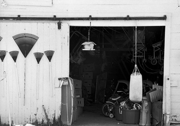
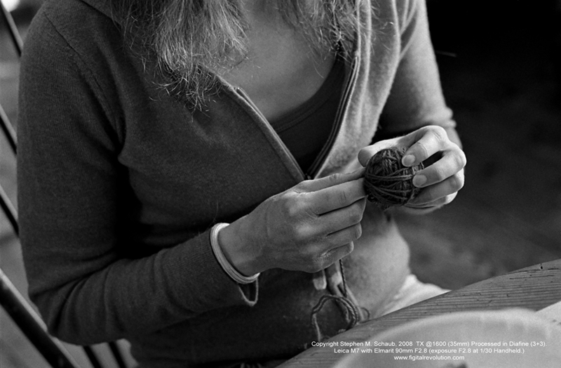
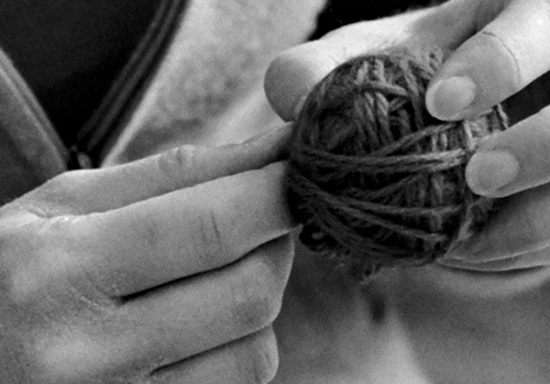
If you’re like me you’re always on the lookout for a great black and white film/ developer combo for scanning. I’ve tried many different films and developers and then recently stumbled upon the great marriage of Diafine and TX (Kodak Tri-x)…my new standard. Watch the videos below to learn more about this dynamic combination and for tips on proper processing techniques as well as a few quick tips on scanning black and white negatives. Be sure to also check out my sample pictures under the videos to see just how good it is. (Click on the images for a larger view.)
Video:
Please note that due to YouTube 10 minute video limit I had to break this 12 minute discussion into two parts. (Be sure to watch both videos!)
Video 1
Video 2
Example Pictures:
This image illustrates the huge dynamic range possible with TX and Diafine. In this example TX was rated at 1600, 35mm. (Check out that shadow detail!)
This example is TX at 1600 in low flat lighting…the full print size is 16″x24″ and the crop is a 4″x6″ section out of the full image area. Film size: 35mm
This example and the close up represent TX at 1600. The final image size (print) is 16″x24″ and the crop represents a 3″x3″ area of the final image at full size. Remember…this is TX at 1600 in 35mm!!
Processing Information for Tested Films:
Fuji Acros 100 EI 200 70-75 5+5 (Best choice for really big enlargements and where an EI of 200 is ok.)
FP4 EI 200-250 70-75 3+3 (Very nice but I prefer PMK for FP4).
TMY-2 EI 500-640 70-75 3+3 (Very nice combo but I’d stick with Xtol or D76 1:1…see my review of this film here on the Figital Revolution.)
TX EI 1250-1600 70-75 3+3 (My personal favorite and my new everyday film. I also keep an ND filter with me (.9) for the bright afternoon light and just remove it as the day ends so I can shoot this film all day long on my M7 with no worries!)
All chemicals are mixed with distilled water. Processing is done by hand with stainless steel tanks and reels.
I will be posting Part 2 in a few days which will cover my scanning techniques (specific and general) as well as basic file handling. Part 3 (next week) will focus on the final print and have a demo (yes another video) on hand coating your own paper for inkjet. Stay Tuned!!
For a quick audioblog on my printing techniques and my thoughts on tonality just click on this link: A Fear of Gray
All images and video Copyright Stephen M. Schaub 2008


 Please click on the logo to listen to the audio.


 I was lucky enough to get a brick plus (35mm) of the new Kodak Ektar film at Photo Expo Plus in NYC… so when I returned to my studio in Vermont I quickly loaded my Leica M7 with a roll and decided to make a few “test” shots around my yard.

 Over the next few months I’ll be writing several articles on the LOMO LCA and LCA+. I’ve decided to use these small and very opinionated cameras for my new artwork series, entitled Vanishing Vermont. Articles will focus on working with these cameras, how to carry them, films to use and why… XPros, where to buy and differences in current and older models.
 Some years ago I did extensive work with pinholes, Zone plates and Holga camera systems, specifically for my
 I find this post very disturbing to write and a sad reflection on our current economic situation here in the US, as well as an unfortunate look at the trend in book publishing to find the cheapest and “good enough” printing press for the production of Fine Art Books. Where are most “fine art” books printed now?…China! That is not to say that good books can not and have not been printed in China, but we all know there is a huge difference between a book printed on a cookie cutter press and one printed at a true fine art printing press.


