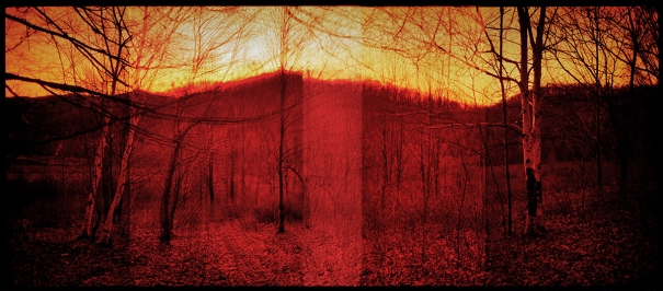
Let’s be clear: I personally don’t like Redscale film and the image below confirms it. It is possibly going to give me nightmares or at least a rash… my wife describes it as the Amityville Horror photograph. Nonetheless, the audio portion of this post describes Redscale film technique and gives pointers on how to maximize your negatives and additional information on how Redscale film techniques works. If this is your cup of tea, then go for it!

LOMO REDSCALE Film Test: March 21, 2009
Camera: Rollei 35 S
Overlapping Frame Technique (3 Frames)
Exposure: F4 @ 1/60, Rated at Box Speed
LINKS:
How to load your own REDSCALE Film.
LOMO REDSCALE Page
Viva la Revolution- Stephen!


I like that shot. What don’t you like about it?
I like the composition and the general image but it is the tone that is just too hard for my eye… I removed over 25 points in saturation and still it is too much for me to look and live with. One way I judge my works is to live with them (I started doing this with my traditional darkroom prints 20 years ago)… so I make a small test image and print it out and hang it somewhere I will see it again and again day in and day out… if after a period of time… a week or in some cases a month I still really like the image then I make a final print, but in this case it lasted 24 hours on the wall and that was it. I like my works to have a more diverse range of tones in most cases. I have made images that emp one tone like Blue but in those cases the image still feels more approachable to me… I wish I had also shot the image with “regular” C41 material for a side by side…. live and learn.
Cheers-
Stephen
I heard of people using a blue filter to reduce the effect slightly.
Hi Stephen,
first of all – it’s great what you’re doing here and I imagine it gves a lot of people a good amount of creative input – it does for me at least.

About RedScale – I don’t like the plain red, orangy tone either but I still love the redscale technique – you wonder why?
I think the “mistake” is to overexpose just by 2 stops over box speed. The short wave blue light has problems penetrating the film layers, so overexposing more gives the light a chance to leave a record in the green and blue layer, thus giving a still redish but more balanced color overall.
So if you turn around an ISO 400 film for the redscale technique I’d recommend shooting at ISO 25!
Check this out as an example (found on flickr):
Wonder if anyone still reads a comment in an almost one year old post…
Anyway – cheers from Hamburg, Germany
Christian
Still reading a ten year’s old post !!
Thanks for the post and the comments .