
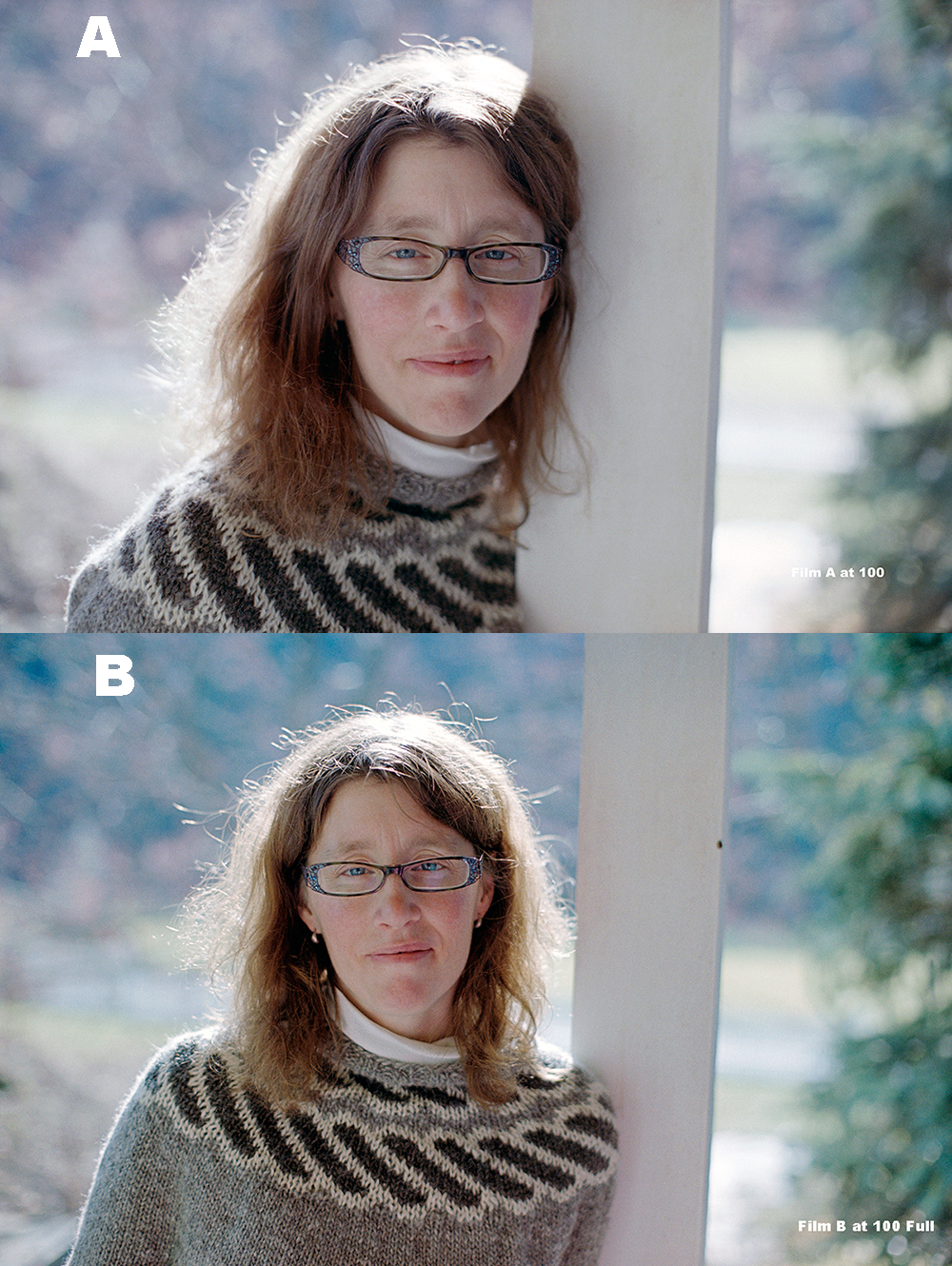
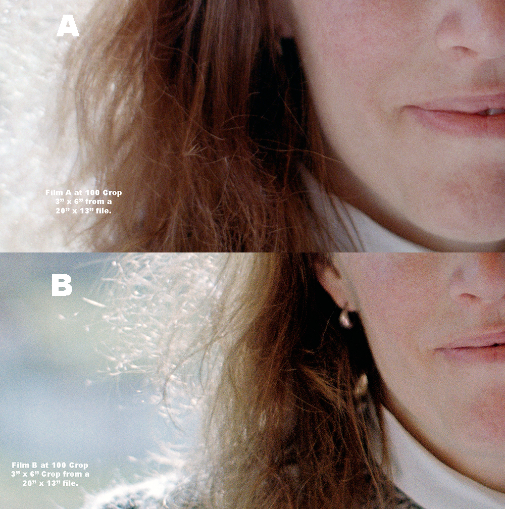
As promised here are example images of the new Kodak Portra 400 film with a bit of a twist… you get to vote! There are two different films shown, both films are a 400 speed color negative material… one of them is the new Kodak Portra 400. Which do you like? Both films have two examples images provided- one at box speed and one using a popular 2 stop overexposure. I have also provided a crop detail of each image at both the 100 and 400 speed settings.
All negatives were scanned on an Imacon Scanner as a 3F linear file with no sharpening… essentially a RAW scan.
All images were processed exactly the same in Photoshop. All images were captured with my Nikon FM3a and a 50mm f1.2 AI lens.
Tell every photographer you know to vote on this as the results will be very informative for our Figital community and will be covered in my fourth and final post on this review on Novemember 23, 2010… vote now!!


Hi Steven
I liked B better at box speed but A better at 100. Thanks for doing these comparisons and examples. I’m looking forward to trying out the new Portra 400 myself. I can’t seem to find it yet on adorama or b&h, do you know when it will be available?
Thanks!
Edmund
I am told very soon… Sorry I can’t be more specific but I will check again tomorrow for more info.
Viva la Revolution- Stephen
Edmund, I agree with you. ‘A’ at 100 and ‘B’ at 400 have the best skin tones, while ‘A’ at 400 and ‘B’ at 100 have an additional warmness, which accents facial redness.
And of course everyone voting has a calibrated monitor.
Right?
One can only hope!!!… but again with the compression of color and tone on the web all polls such as this only go so far…
B&H has Portra 400 in 120 in stock today, in both single rolls and pro-packs. Looks like they are done entirely with Portra 400NC in 120; it’s listed as discontinued.
There is still 400VC available, which tells me that Kodak doesn’t nearly as much of it as it did the NC. FWIW.
The photos posted above are not properly color corrected, so the results are invalid.
Your comment is invalid… is your monitor calibrated like my Eizo- who knows- and also you are viewing color on the web so we are not talking super accurate… color is subjective…
I found some examples of new portra on the net. My first impression is that new portra is excellent for portrait and has fine grain but I like the old NC colors more. I do not why.